Using Color Theory to Design Cool Cars
Oct 6, 2019
Read Time: 2 minutes
Some people have a knack for designing awesome looking cars, others might wonder how they do it. These "artsy" types of people usually rely on their experience (learned through lots of experimentation) to help guide them on what color combinations look good. But what many of us don't realize (artsy or not) is that there is a pretty great guide for determining what colors look good together - the Color Wheel!
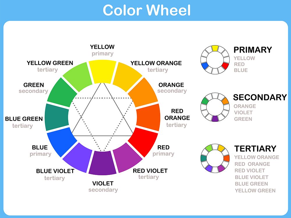 (image credit: www.creativeboom.com)
On the color wheel, complimentary colors are those that you find opposite of each other on the circle. As you'll notice, red is opposite of green - no wonder these holiday colors work so well together.
So if you'd like to take a more "formal" approach to designing a car follow these steps:
- Pick a "hero" color. The main color that you want to use throughout your design.
- Now look at the color wheel and find the color directly opposite to your "hero" color. Use this as a secondary color throughout your design.
- You can always mix neutral colors (black, white, grey) into your design and it should remain looking good.
Example of a complimentary color scheme:
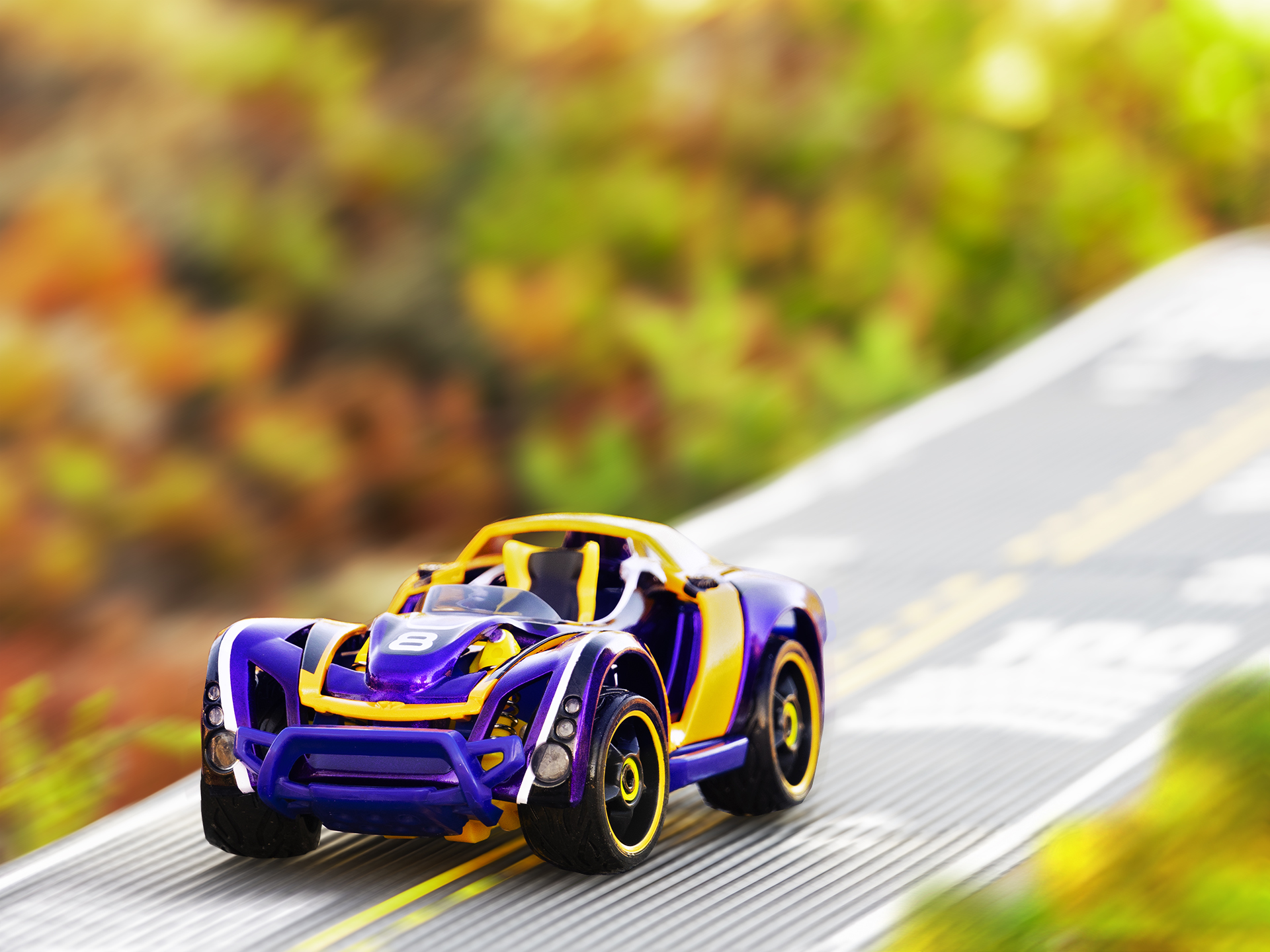
Another option is to pick colors that are right next to each other on the color wheel. These are called "analogous" colors, and they look good together also.
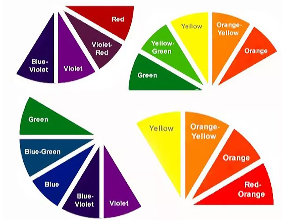 (image credit: https://www.thespruce.com)
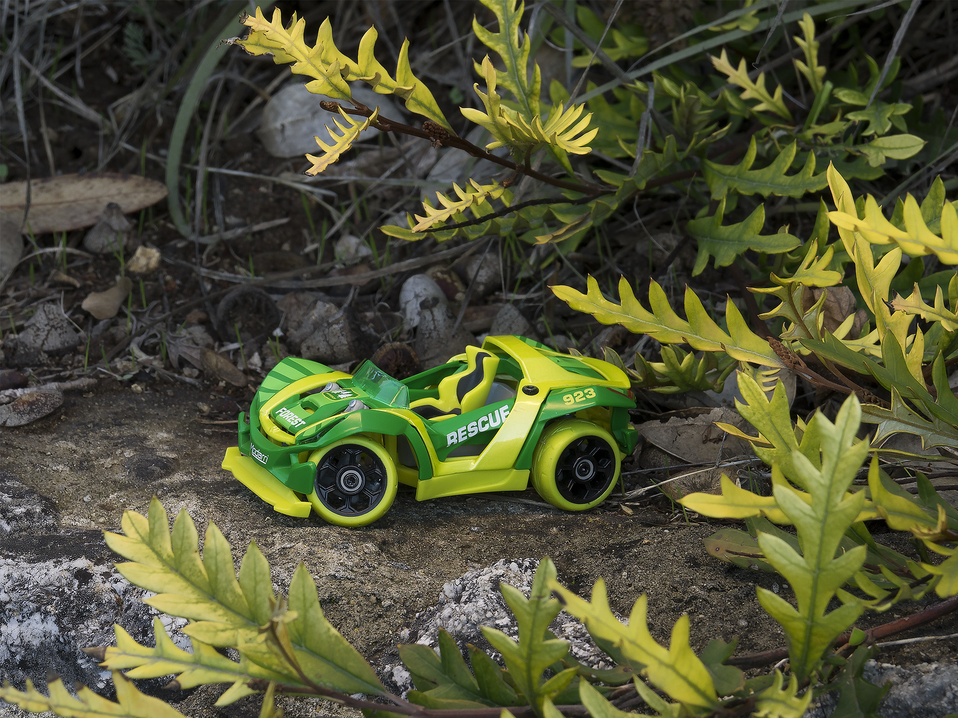
Example of an analogous color scheme:
You can also take one solid color and mix it with a single neutral color for a bold look (just try to go for a nice contrast of dark vs light).
Example of neutral color + a single color:
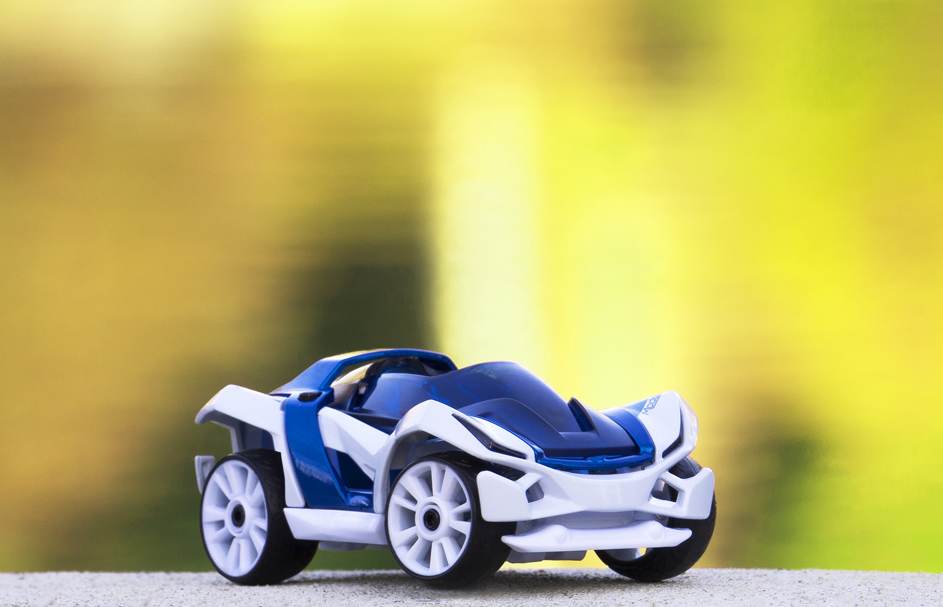
Now, keep in mind you can always break the rules and create an awesome looking car that doesn't use any of these concepts at all! Modarri is all about experimenting with different part combinations to discover that fresh look :)
Share your car designs with us by tagging us @modarri for the chance to be featured on our social media. We really want to see what you've made!
